Do Breathe.
Change starts with the breath.
Concept Project • 3-person team • 2.5 weeks sprint
The Challenge
The world is more stressed than ever. Do Breathe help busy people with complicated lives to calm down, find focus, and live with more purpose and less stress.
For this project, our team was tasked with redesigning the current beta app - improving engagement and retention as well as improving the onboarding for first time users and enhancing the way users see the benefits of using the app.
The Solution
Using the Double Diamond of UX, we built our solution based on user insights gathered through interviews, surveys, and extensive testing on each fidelity iteration.
We created a quick and informative onboarding where users can immediately read about Do Breathe and its benefits, implemented a gamification feature and a progress section where users can easily access specific information regarding their progress.
My Role
Competitive analysis, user research, user interviews, app map, affinity mapping, persona, empathy map, problem statement, HMW’s, design studio, feature prioritisation, user flow, user testing, wireframing, prototyping, usability testing, UI, presentation, interactive prototype.
Tools: Figma, Adobe Photoshop, Miro
— Read the full case study on Medium
Discover
Testing the existing app.
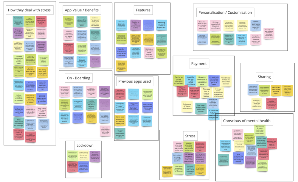
The first step to improve the existing beta Do Breathe app was to understand how users felt when going through the app and accessing its features. Through several user tests, we isolated three main pain points:
Sign up is compulsory and happens before anything about the app is explained.
Users loved the visuals of the breathing exercise and found it easy to follow; however, they didn’t get much value in terms of what it’s being measured at this step
The session summary screen offers very limited value for the user as this data doesn’t provide any performance information
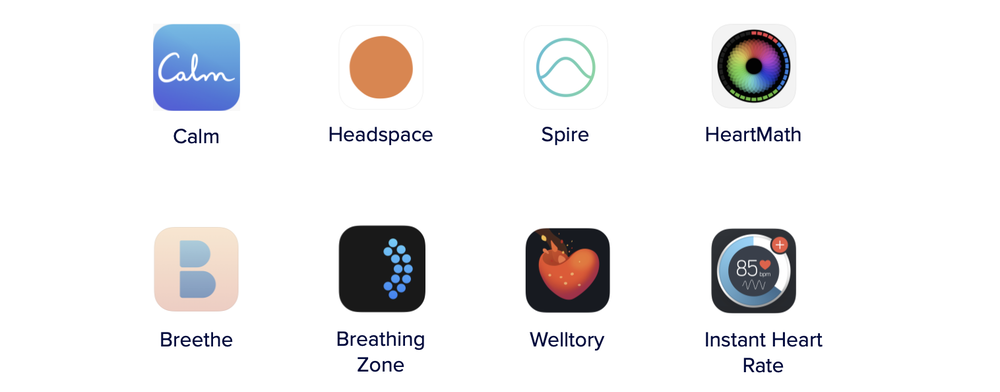
What do the competitors offer.
We analysed 8 competitors, and by looking at their main features and offerings we were able to draw some main insights, particularly features that were missing in the existing Do Breathe app:
a clear and informative onboarding
profile screen where users would be able to track their progress
clear and intuitive navigation
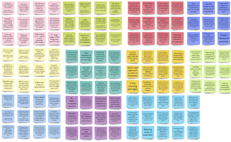
Understanding the user.
Our user research revealed a number of trends about potential users:
People are conscious of their mental health and wellbeing
Users look for simplicity above all else
Having a visual dashboard/profile screen was an important feature for users as this would help them track their progress
People enjoy having a social aspect within the app
Users want to be able to see the value of using the app
Define
Hello James.
After synthesizing the findings from our user research, we created a persona, James, which we referred to throughout the project, to ensure we didn’t stray from the user’s needs.
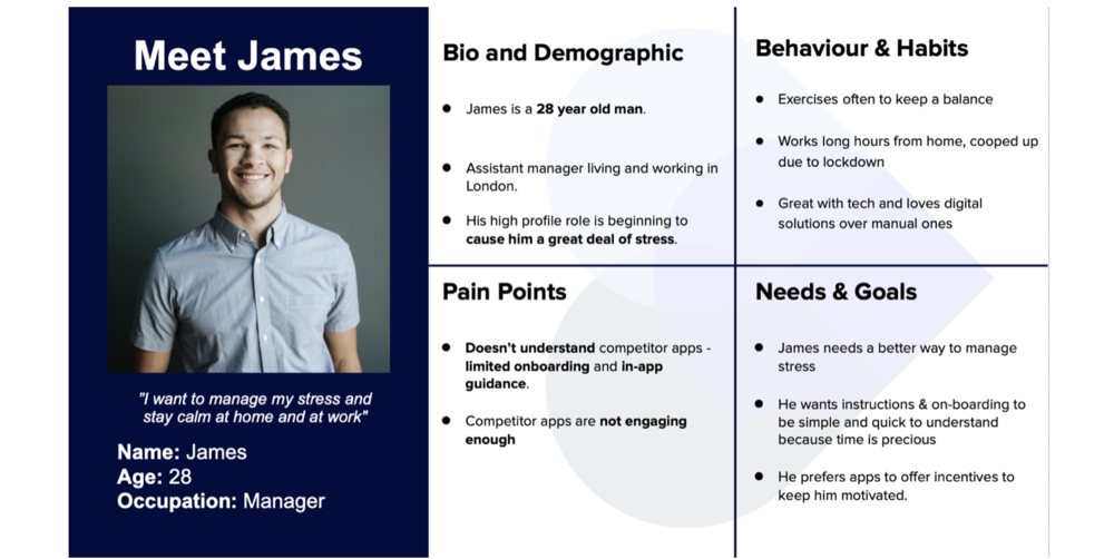
Defining James’s problem.
James…
needs a way to… remain calm and quickly find focus in stressful situations
so that… he can build on his physical and mental resilience.
Develop
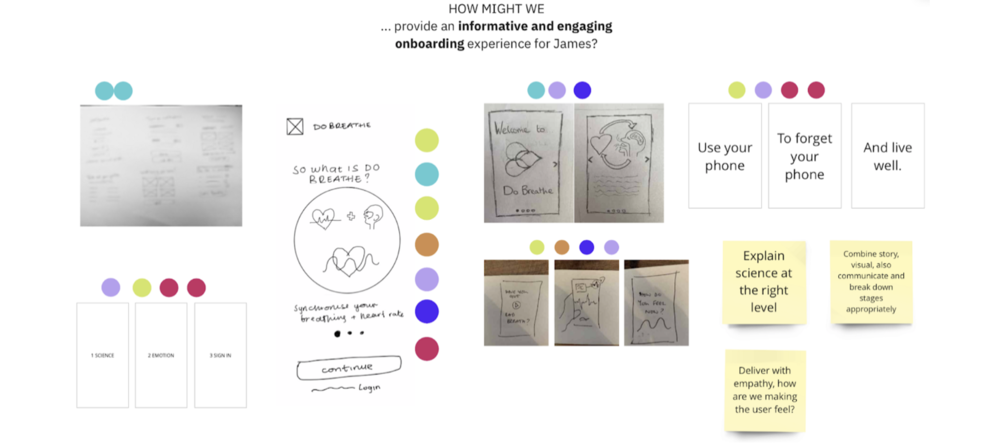
Enter our Design Studio.
We conducted a design studio with the client, Do Breathe, for which we used the How Might We (HMW) design thinking in order to see how we can resolve James’s problem:
How Might We…
provide an informative and engaging onboarding experience for James?
communicate to James the benefits of breathing in sync with his heart?
provide a visually stimulating way for James to track his progress?
We sketched our ideas individually for each HMW statement and then regrouped to share and dot vote to see which ideas appeared to be the strongest.
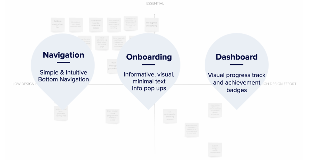
Feature prioritisation.
We came out of the design studio with plenty of ideas. The next day, we met as a team and discussed all the solutions that came out of the design studio. We decided to do a content and feature prioritization using the MoSCoW and 2x2 Matrix methods to help us think about what features would help solve our user’s painpoints the most.
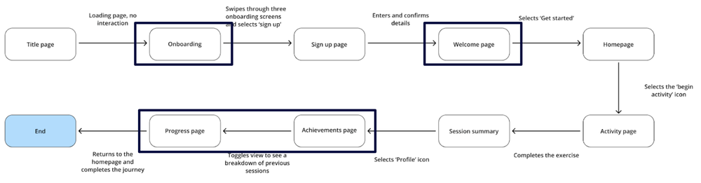
Outlining a user flow.
After having defined the problem, sketched possible solutions with our client, and prioritized our features, we were ready to think about the user flow. Below is our proposed flow a first time user will go through when using the app.
Deliver
Prototyping.
We went through 3 different rounds of iteration, moving from low to mid and hi-fidelity. After every usability test, we iterated to ensure our app was meeting and exceeding users’ expectations.
By documenting all our usability tests insights on a Miro board, we were able to quickly identify the main design issues and keep iterating.
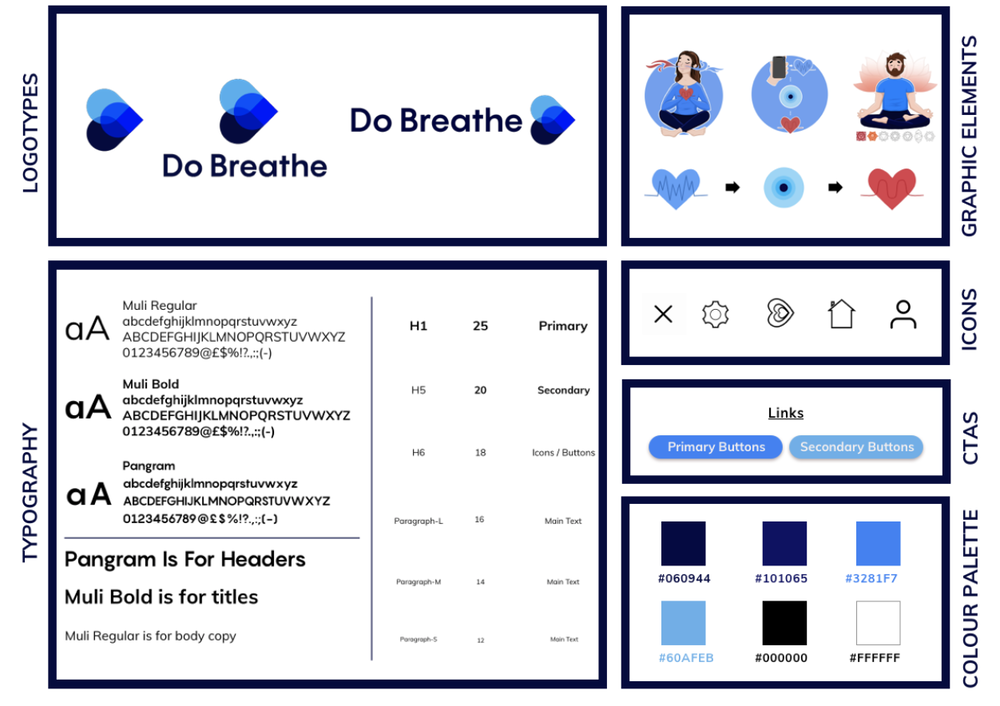
Design system.
During this phase, we also produced a style guide to help us stay focused and ensure that we use the correct Do Breathe colours and elements.
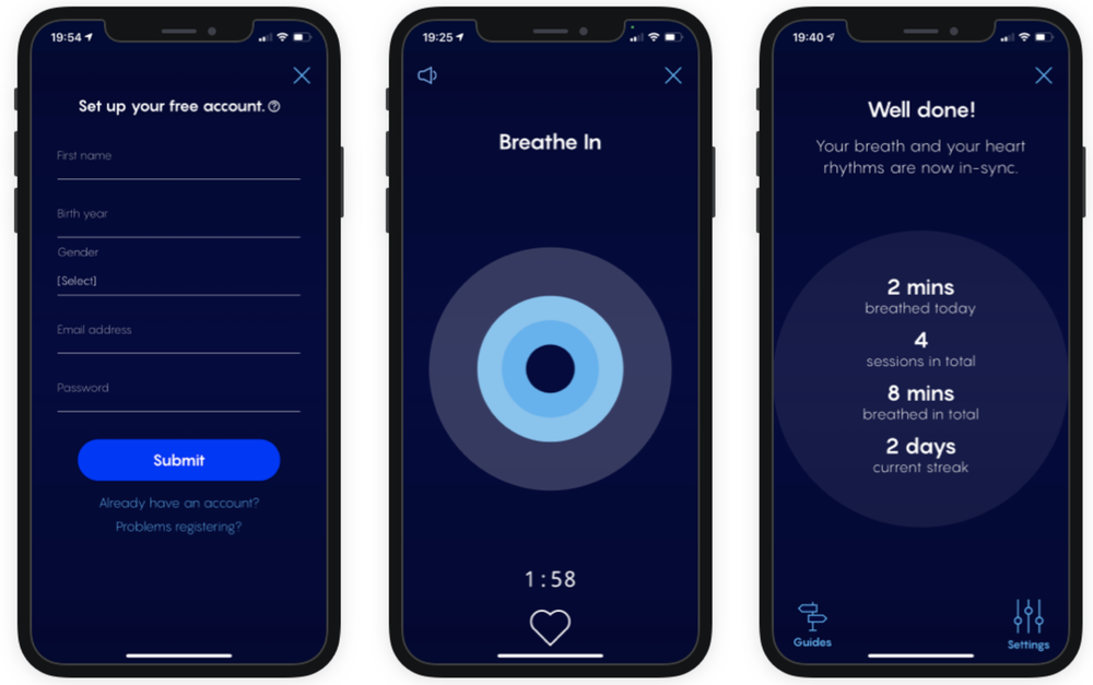
Iterations.
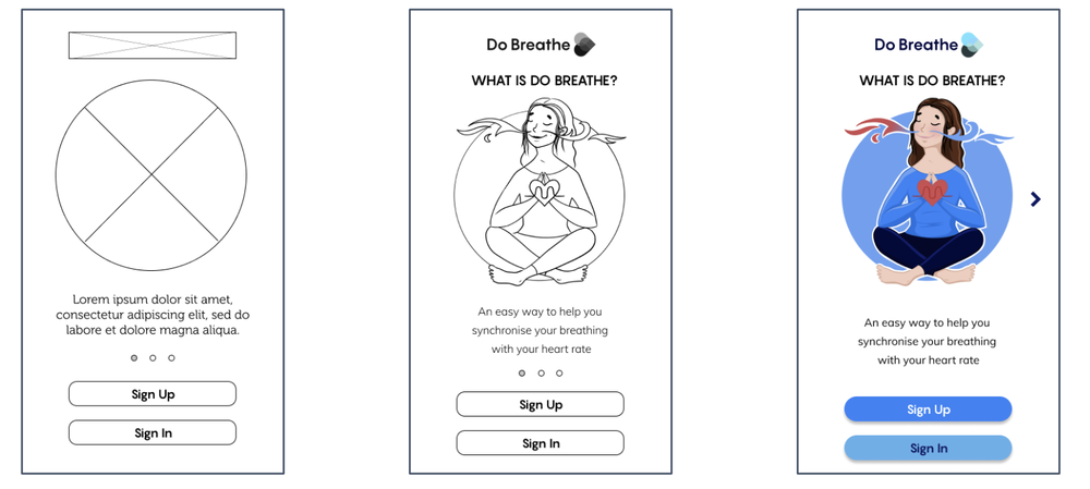
Onboarding
Testing suggested that the navigation was not intuitive hence this was updated in the hi-fidelity version for which the user feedback was much more positive.
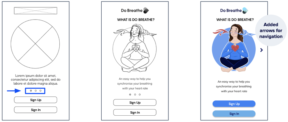
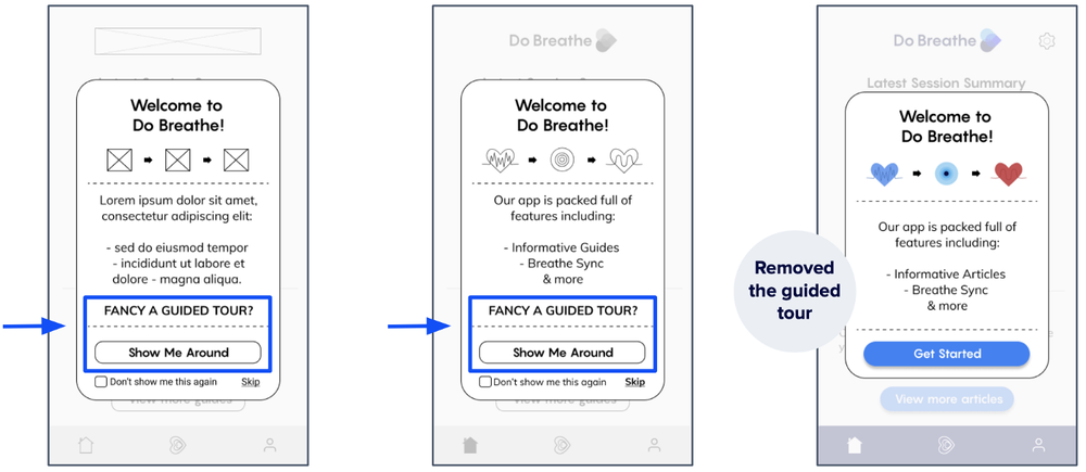
Welcome screen
The low and mid-fi versions introduced a guided tour which was then removed for the hi fidelity version as per the user feedback which suggested that users would preffer to explore the app and find information as they explored on their own.
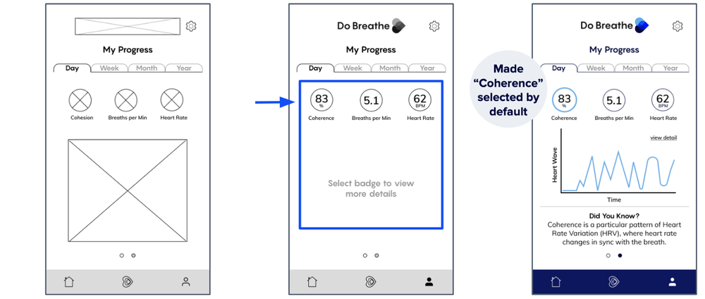
Progress screen
Users wanted to view more information when they accessed the Progress screen in the first instance therefore we made the Coherence figure selected by default and included a Did You Know section at the bottom of the screen to help users read and learn more about the selected topic.
The end. Our solution.
At the end of this design sprint, we were able to deliver a working, clickable prototype.
The key interactions and flows of the high-fidelity prototype are shown below (designed and animated in Figma).
Outcome
The final design concept included:
A clear onboarding, where users can immediately read about Do Breathe and its benefits
A welcome screen that welcomes the user and creates a warm feeling
Introduced a gamification feature
Users can now access specific information regarding their progress via our new progress feature
Reflections
Through this project, I learned the importance of getting your client on board with your design decisions by including them in the process. We held a design studio session with them to generate ideas and set the expectations on what features will be prioritized. This was really helpful in getting us to move forward with our work and process without any surprises.
Next Steps
We presented our findings and solutions to Do Breathe in a 20 minutes presentation on Zoom. Our solutions were very well received and some of our suggested next steps that would be interesting to investigate further are:
Progress sharing with friends and family
Customisation
Setting reminders for regular breathing exercises