Environmental Law Alliance Worldwide
Redesigning the website for an environmental charity
Concept Project • Solo • 1 week sprint
The Challenge
Re-skin and rebrand two pages from the ELAW website and give it a much needed design makeover, creating a responsive website on mobile, tablet and desktop.
The Solution
Designed a website that was easier to navigate with a focus on increasing the fundraising potential while still communicating the personality of the brand.
My Role
Competitive Analysis, Mood Board, Brand Identity, Tone of Voice, Style Guide, High-Fidelity Responsive Designs across 3 Devices.
— Read the full case study on Medium
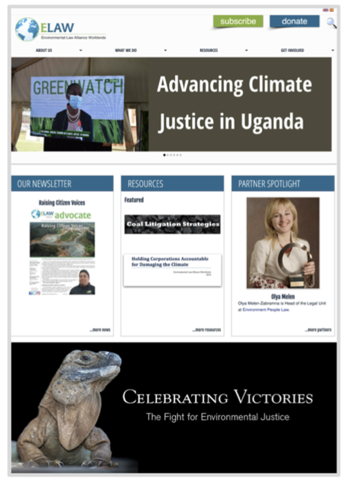
Current look and feel of the website.
The website looks to showcase the work of this network by guiding readers through the organisation’s success stories. Despite its informative structure, the site is difficult to navigate and struggles to emphasise the charity impact. This comes down to:
unintuitive content
oversized buttons and icons
inconsistent use of white space and unrelated stock imagery
I decided to re-design the website and reinforce the values of the charity and their personality as straight talking people by giving it a modern, bold and impactful feel.
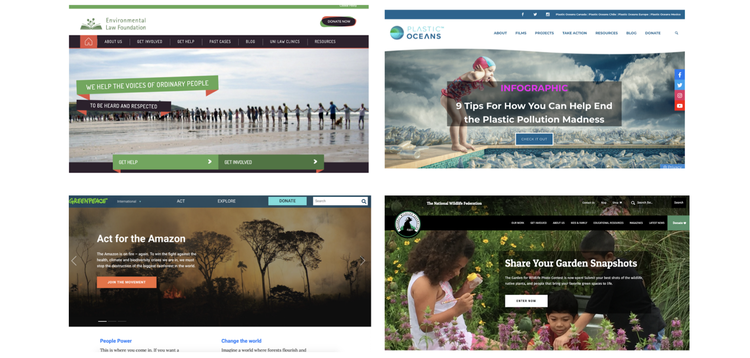
Our Competitors.
Key findings:
There is an emphasis on impact across the organizations’ websites
CTAs to donate are visible in numerous places throughout the sites
Distractions (such as external links) are kept to a minimum on the Donation page to boost conversions
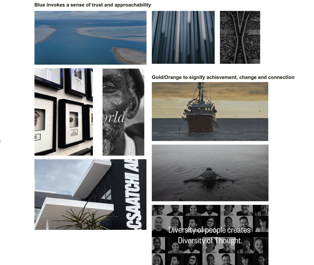
Mood Board.
I set out to create a moodboard in order to explore the brand principles through visuals.
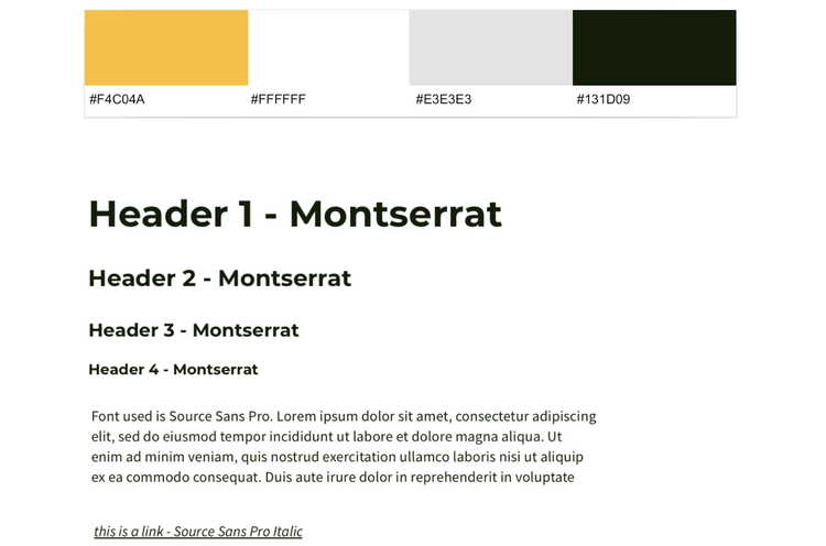
Style Guide.
This is where I recorded my design elements and it’s what brought cohesion to my design.
I wanted the logo to feel affirmative whilst encouraging people to explore the name behind the ELAW acronym. I then finally decided on the third variant.

“We strive to educate and provide solutions that will help bring awareness and support in the battle against today’s eco environmental challenge. Changing the world is possible, we’ve done it before.“
Tone of Voice.
Final Design
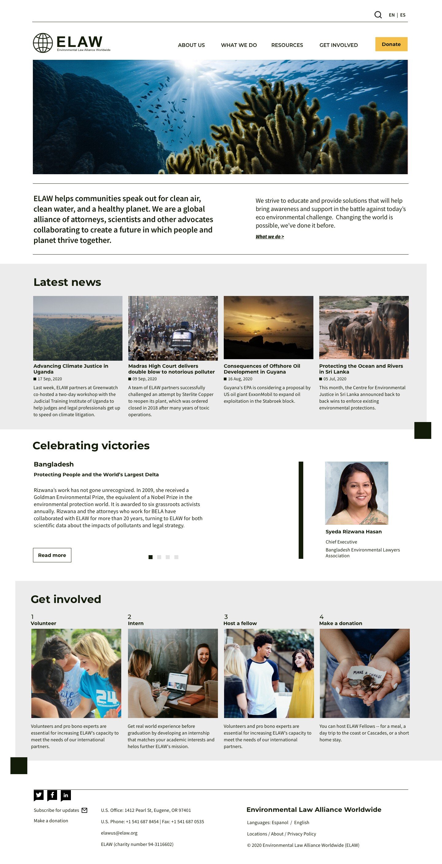
Homepage - Desktop version
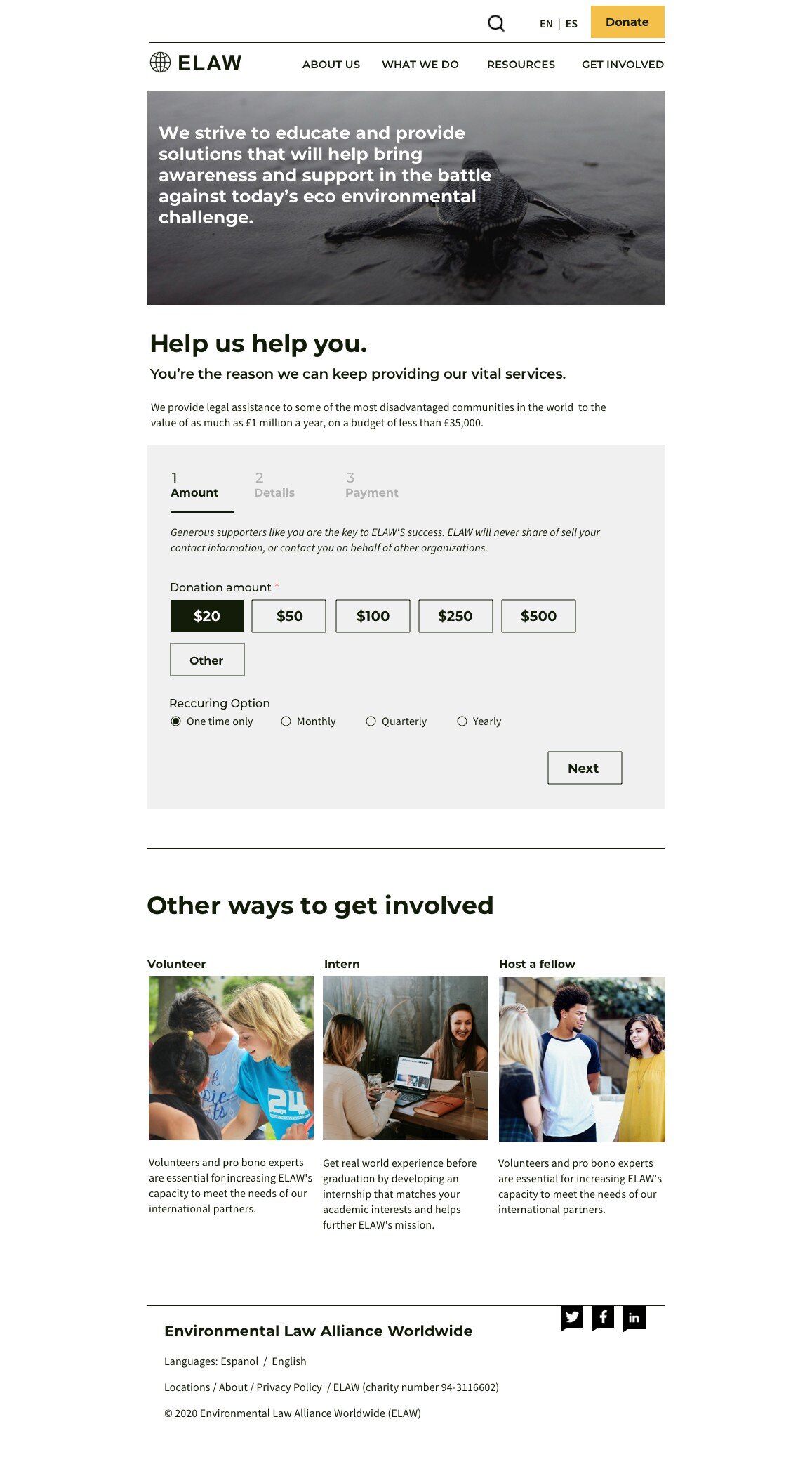
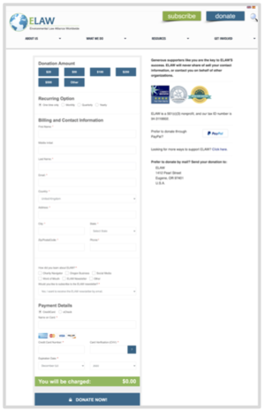
Donate page - Tablet version
Outcome
My design concept included:
Yellow as an accent colour in the donate button
Long page layout encourages the user to scroll down and find out more about the charity
The donation process has been broken down into three easy steps
A donation amount is pre-selected so donors can easily go through to the next step
Learnings
I thoroughly enjoyed working on this project, as it is a cause I am trully passionate about.
I learned how adding small design elements into the page can make a huge difference and can influence the entire look and feel of the design.
Next Steps
As next steps, I would enhance the ‘Donate’ page even further by adding a progress bar to build on the user experience and give it a visual aid. I would also conduct more usability tests & iterations and redesign the current sitemap in order to make it easier to navigate through the site.