Background
Just Eat for Business (part of the Just Eat Takeaway group) is an online marketplace passionate about making working lives better - be that in the office or at home. They partner with restaurants and caterers, then deliver their food straight to offices all over the UK.
The legacy City Pantry model was built for a Corporate user base, centred around the marketplace model. However, a shift in business strategy and large B2B food ordering conditions has led to the increasing development of Individual Choice as a core product.
The Challenge
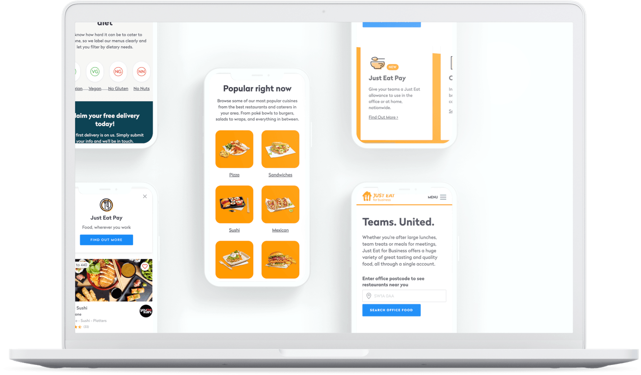
The Just Eat for Business website is optimised towards desktop usage and users have frequently reported that they are unable to order on their mobile devices, resulting in them having to transition to desktop to complete the task. Fundamental usability was challenged. Disparate features competed for focus.
The answer: design an ordering experience where Eaters can easily use the website when they are away from their desk so that they can order what they want, when they want.

Discover
Broadening the scope to understand the problem

Define
Narrowing the scope and defining the problem

Develop
Generating ideas to solve the problem, prototyping and user testing

Deliver
Delivering a design based on testing, iteration and user insights
Kickoff
Picking up the pieces
At the beginning of this project, I didn’t have a clear mission or specific goals for the Eater experience on mobile. Without pre-existing insights, I conducted usability tests with 6 participants to explore how Eaters were ordering their meals. My goals were to understand the challenges Eaters faced and the workarounds they employed.
Insights from the tests
Budget conscious
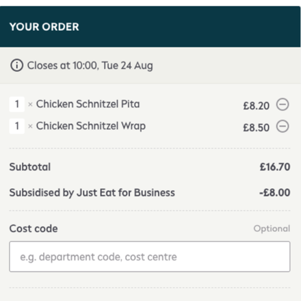
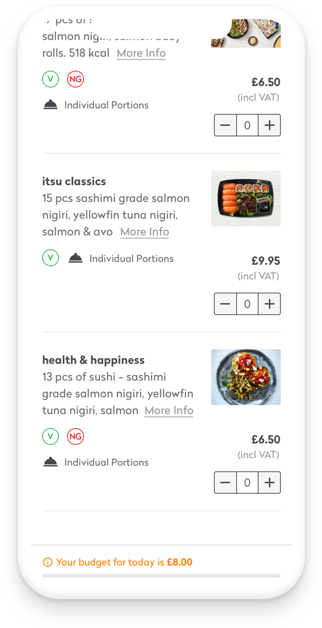
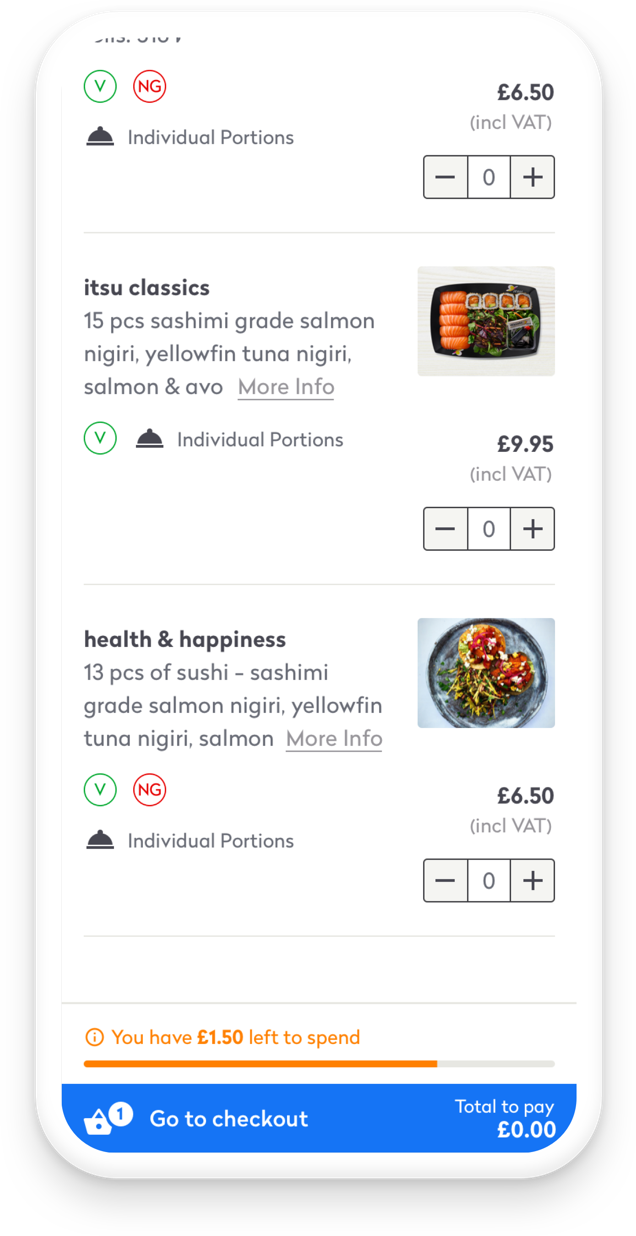
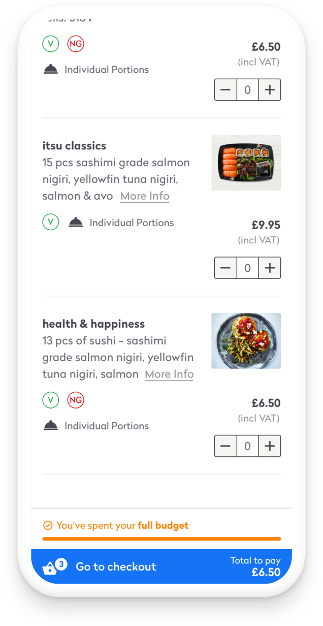
Eaters were annoyed about the fact that they had to scroll to the bottom of a long screen to access their cart. Users also found it difficult to see what their current budget is and to locate items left within that budget. This adds to the time it takes to place an order, and is more likely to lead to abandoned carts, or the user not maximising their allowance.
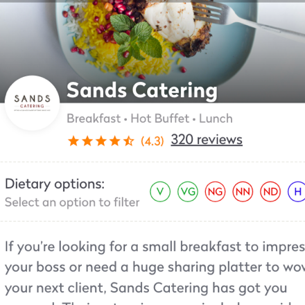
Dietary filters
Users can filter the items on a Restaurant’s menu through a multitude of lenses: vegetarian, vegan, halal etc, however, these filters did not prove to be intuitive or accessible on mobile devices.
Suboptimal restaurant menu navigation
The current tabbed nav causes difficulty in moving through the menu categories, users felt that making their way through the menu was quite complicated.
Meal selection
The current display of upcoming meals on the My Meals page can easily cause errors and confusion when ordering, especially if the office manager has placed orders for weeks in advance.
Competitive analysis
B2B vs B2C
Making the corporate ordering experience more seamless, with companies being able to easily create business orders through the website, is important for Just Eat for Business, as a company operating in the B2B space.
Our modular approach takes inspiration from various B2C online marketplaces. It incorporates clear calls to action, empowering users to have control of their shopping cart. They can effortlessly adjust the quantity of items, easily view the number of items in their cart, and quickly see the total cost of their order at a glance.
Deeper insights
Digging into the data, revealed some big insights into the ordering experience. A vast majority of orders were dropped on mobile.
The mobile site made it difficult for users to order food. Eaters expect to have a reliable and consistent mobile ordering experience. They are frequently unable to place an order on their mobile without having to move over to desktop which results in a frustrating and time consuming experience.
I used the ‘How might we’ framework to refocus the user challenges and needs from the research into an opportunity to start designing solutions:

How might we
better communicate to our users the budget they are entitled to?
How might we
provide an easy way for our users to access their cart?
How might we
reduce the time in which Eaters choose their food and place orders?
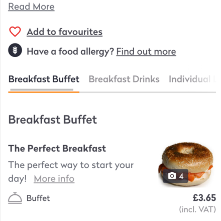
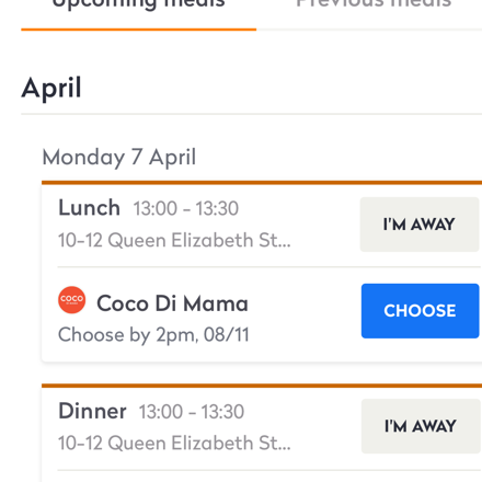
The ordering redesign
Starting with pen&paper sketches followed by mid-fidelity concepts, my goal was to explore ways for displaying a simple yet informative sticky cart whilst ensuring that Eaters are informed of their remaining budget at all times.
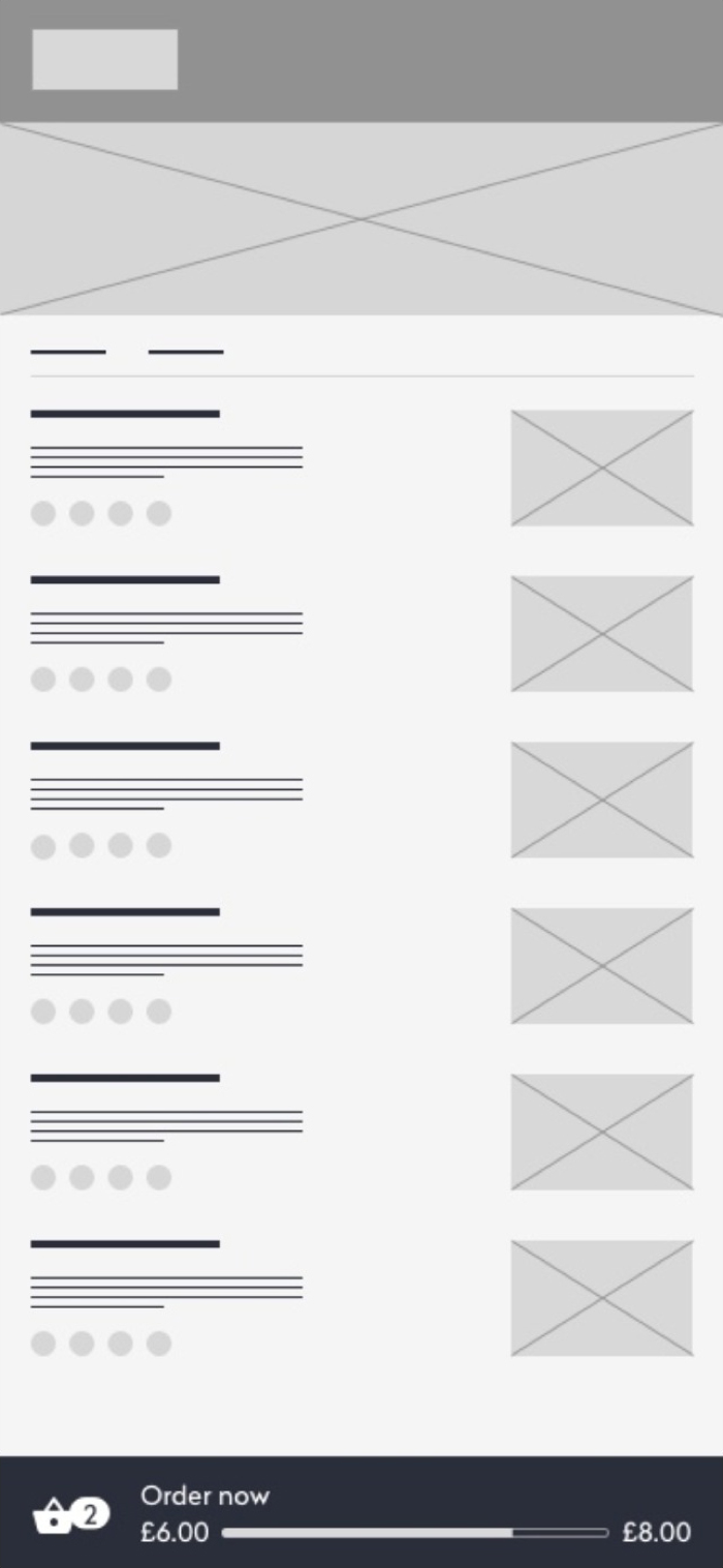
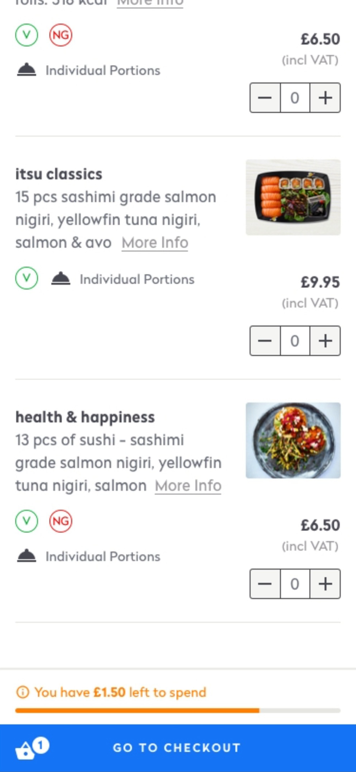
Design iterations exploring ways for displaying a simple yet informative sticky cart
User testing
Reducing risk through testing
I spoke with 5 individuals to better understand how customers place food orders in the context of their role and Just Eat for Business's offering. The primary objective was to better understand their experiences and preferences while also identifying opportunities for enhancing the design and user experience.
01
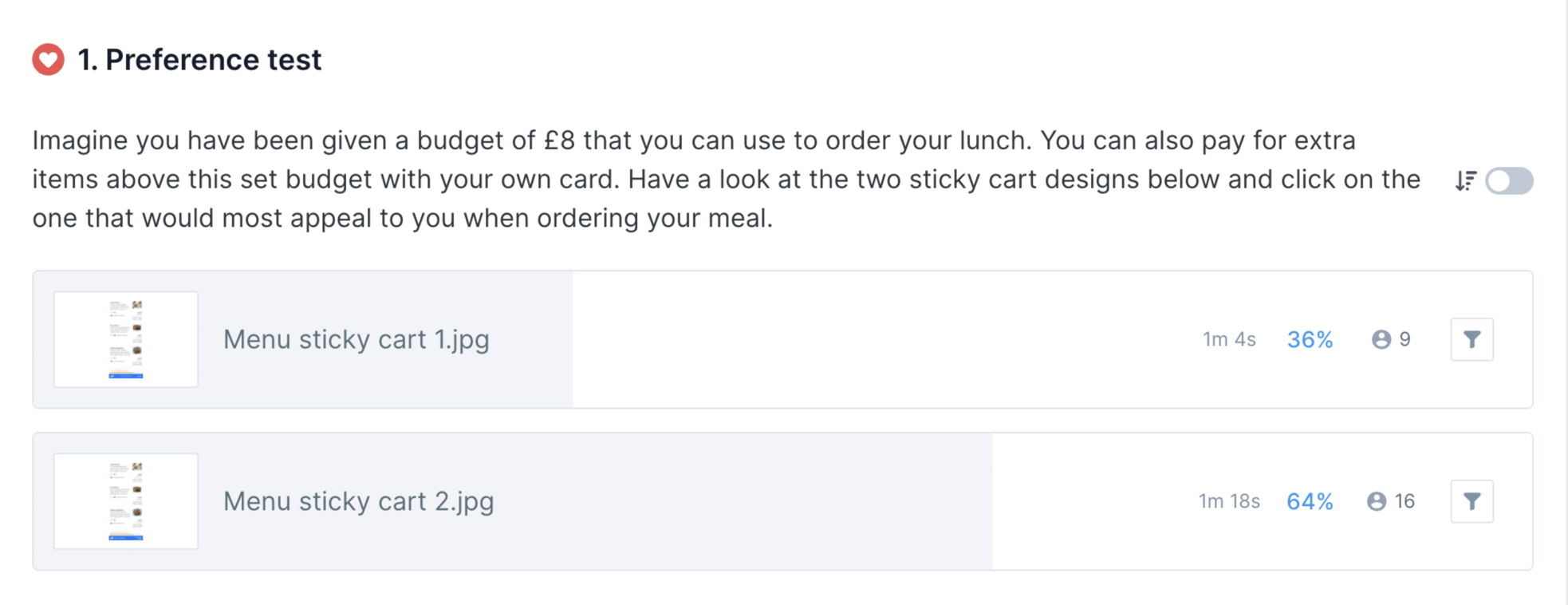
All participants showed a preference for seeing both their budget and total amount to pay
"The progress bar along with the amount left to spend encouraged me to try and find another item that fits within this remaining budget.So I'll probably look through the whole menu."
02
Vendor description takes too much space.
"The first part that I'm seeing is the vendor's photo and the description as opposed to seeing the food itself."
03
The progress bar serves as an aid to help users make the most use out of their given budget.
"I like being able to see the budget whilst I'm going through the menu, I think that's very important."
Usability Hub
Using Usability hub, I sat up a preference test where users were prompted to choose between two design options in response to a specific question. Using the participant's preference choice, the test also followed up with participants in a bit more detail by asking them questions related to the option they have chosen.
Introducing the final designs
The optimised Eater journey

01
From inefficient to optimised
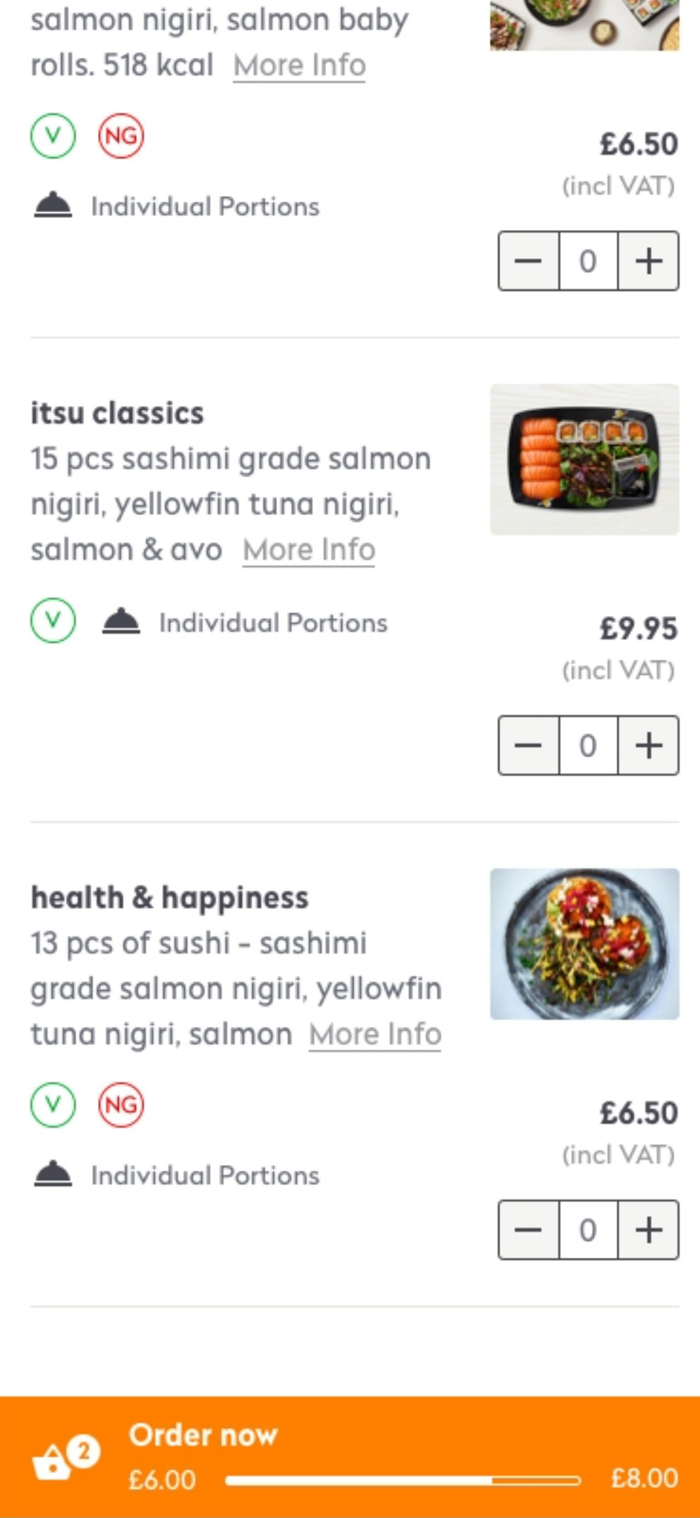
Eater cart
In an age where everything is demanding your time, Just Eat for Business gives you your time back by making the process of food ordering fast, effortless and calm.
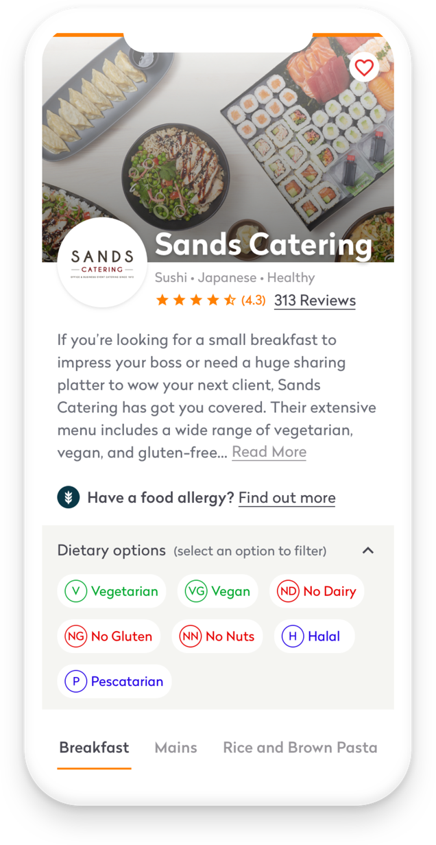
02
From ambiguous to obvious
Dietary filters
Food plays an important role in maintaining a balanced lifestyle, therefore, health and wellbeing is front of mind for users.
Users were not engaging with the dietary filters to narrow their search due to a lack of awareness, therefore it was important to improve awareness and adoption of the filtering feature.
03
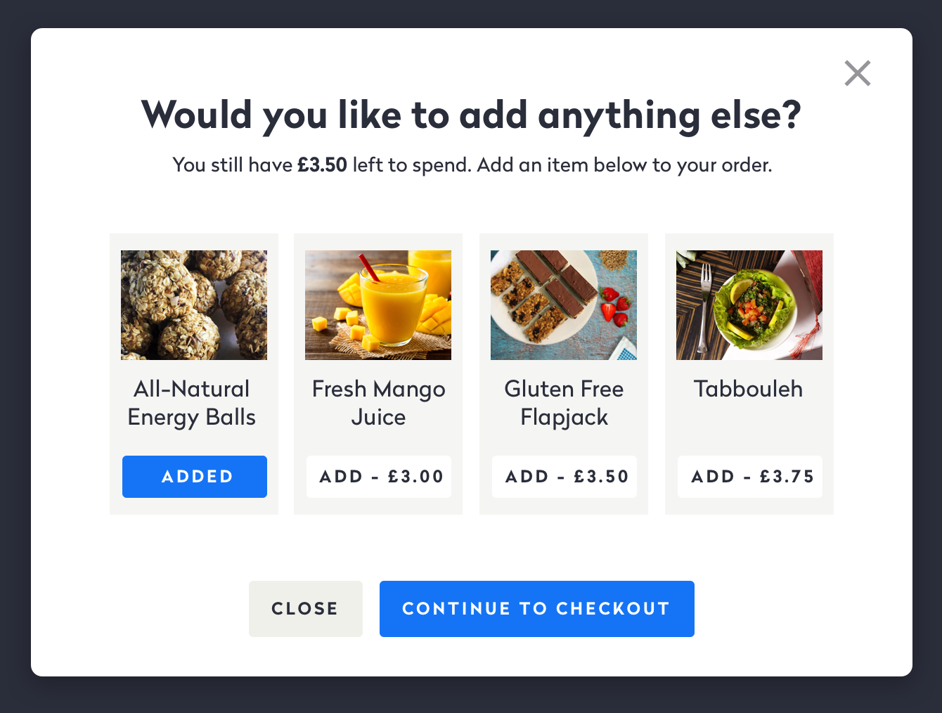
Eater upsell at checkout
During testing, Eaters have communicated that they find it difficult to locate items left within their allowance.
The eater top-up is a feature displayed at the point of checkout. It visually draws the user’s attention to items they could purchase by displaying a range of nutritional items or sides that fit within their budget.
Given the experimental nature of this idea, we decided to try it out on desktop first and analyse with a less intelligent version.

The takeaways
As a more creative project, this was both a dream come true and a venture into unknown territory.
Overall, this was the most rewarding project I worked on at Just Eat for Business which allowed me to acknowledge and challenge legacy thinking, and to collaborate with various cross-functional team members.